7 Checkout Optimisation Tweaks That Increased Revenue by 23%
Small changes to your checkout flow can have an outsized impact on revenue. Here are seven tests we run for ecommerce stores and the results, illustrated through a representative example.
Key Takeaways
- The average ecommerce checkout converts at 35%. In a representative engagement, seven targeted changes lifted checkout conversion to 43%, a 23% revenue increase with zero additional traffic.
- Guest checkout alone reduces abandonment by 24%. Forcing account creation is the second most common reason shoppers abandon checkout.
- A single-page checkout outperforms multi-step by 10-15% because it reduces perceived effort and lets shoppers see the full cost upfront.
- Express payment buttons (Apple Pay, Google Pay, PayPal) increase checkout conversion by 29% by removing the need to type card details.
- Displaying a trust badge and security indicator near the payment field increases conversion by 12-15% by reducing purchase anxiety.
The checkout page is the most important page on your ecommerce store. It is the moment of decision. Everything before it, the product page, the navigation, the search, exists to get the shopper here. And yet, most stores treat the checkout as an afterthought.
The average ecommerce checkout converts at 35%. That means 65% of shoppers who add something to their cart leave without buying. To illustrate the opportunity, consider a representative ecommerce store generating £160K per month. In this example, we ran seven targeted checkout optimisation tests. The result was a 23% revenue increase, with zero additional traffic. Here are the seven changes and the data behind each one.
23%
revenue increase from seven checkout optimisation tweaks, with zero additional traffic
Tweak 1: Enable Guest Checkout (24% Less Abandonment)
Forcing shoppers to create an account before buying is the second most common reason for cart abandonment, cited by 24% of shoppers in Baymard Institute research. The instinct to require account creation is understandable: you want the email address for marketing. But the cost is enormous. Shoppers who encounter a forced account creation step abandon at nearly twice the rate of shoppers offered guest checkout.
The fix is simple. Offer guest checkout as the default option. Place the account creation prompt after the purchase is complete, not before. Once the shopper has bought, they are far more likely to create an account because they already trust you. Our client saw a 24% reduction in checkout abandonment after enabling guest checkout as the default.
Implementation
- Make guest checkout the default option. Place it above the login/register option.
- After the purchase is complete, show a single prompt: 'Create an account to track your order and save your details.' One click, no additional form fields.
- If you use Shopify, enable 'customer accounts optional' in checkout settings. If you use WooCommerce, use a guest checkout plugin that removes the account requirement.
Tweak 2: Single-Page Checkout (10-15% Higher Conversion)
Multi-step checkouts create friction. Each step is a decision point where the shopper can second-guess the purchase. Single-page checkouts reduce perceived effort because the shopper can see the entire form at once, including the total cost. This transparency builds trust and reduces the anxiety that leads to abandonment.
Our client moved from a 3-step checkout (shipping, delivery, payment) to a single-page accordion checkout. All fields are visible on one page, with collapsible sections for shipping address and payment. The result was a 12% increase in checkout conversion. The key is that the shopper never feels like the form is getting longer, because they can see the end.
Implementation
- Consolidate shipping, delivery, and payment onto a single page using collapsible accordion sections.
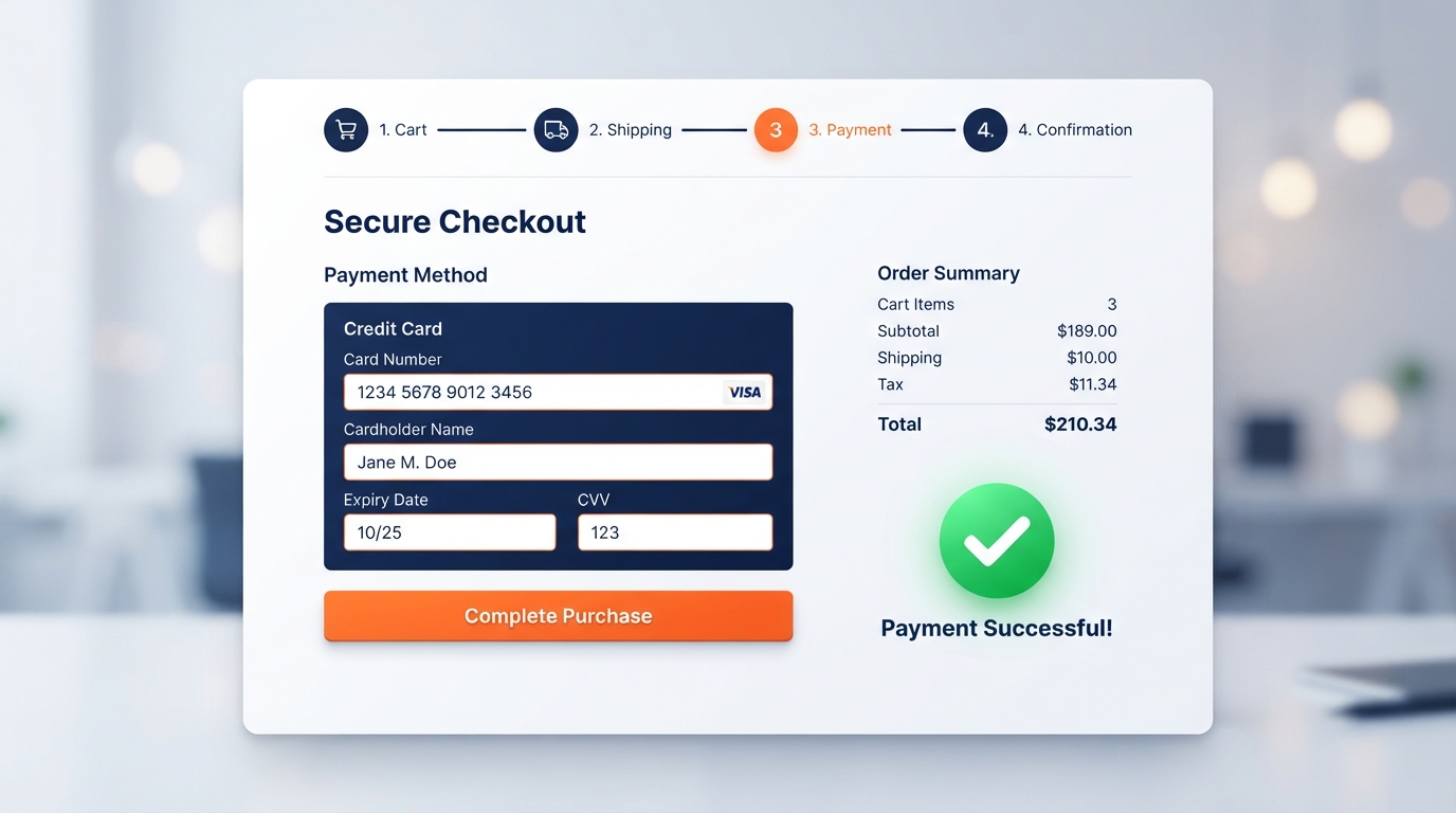
- Show the order summary (items, subtotal, shipping, total) in a sticky sidebar so it is always visible.
- Auto-fill city and postcode based on the postcode entered. This removes 3 fields and saves 20 seconds.
- If a single page is not feasible, use a progress indicator (Step 1 of 3) so shoppers always know how many steps remain.
12%
checkout conversion increase after moving from a 3-step to a single-page accordion checkout
Tweak 3: Express Payment Buttons (29% More Conversion)
Apple Pay, Google Pay, and PayPal Express buttons are the single highest-impact addition you can make to a checkout. They let shoppers pay with a single tap or click, without typing card numbers, expiry dates, or billing addresses. According to Shopify data, stores that add express payment buttons see a 29% increase in checkout conversion.
The reason is friction. Typing a card number on a mobile keyboard is slow and error-prone. Apple Pay and Google Pay remove the entire payment form. The shopper authenticates with Face ID or fingerprint, and the payment is complete in under 5 seconds. Our client added Apple Pay and Google Pay at the top of the checkout page, above the manual card entry form. Express payments now account for 34% of all transactions.
Implementation
- Place express payment buttons at the top of the checkout, above the manual card entry form.
- Include Apple Pay, Google Pay, and PayPal at minimum. If your platform supports Shop Pay, add it.
- Ensure the express buttons are styled consistently with your brand but use the official payment provider logos for recognition.
- On mobile, make the express buttons full-width and place them above the fold.
Tweak 4: Remove Distractions (8% Lift from a Cleaner Page)
Your checkout page should have one goal: completing the purchase. Anything that distracts from that goal reduces conversion. This includes navigation menus, search bars, product recommendations, social media links, and promotional banners. The shopper has already decided to buy. Do not give them a reason to leave.
Our client removed the header navigation, footer links, and a 'you might also like' product carousel from the checkout page. The result was an 8% conversion lift. The page felt calmer and more focused. The shopper's only option was to complete the purchase or close the tab, and most chose to complete it.
Implementation
- Remove the header navigation and footer from the checkout page. Replace with a minimal logo and a 'continue shopping' link.
- Remove product recommendations, cross-sells, and upsells from the checkout. Move these to the cart page instead.
- Remove any promotional banners or pop-ups. The checkout should be silent.
- Keep only the order summary, the form fields, and the CTA button.
Tweak 5: Show Trust Signals Near the Payment Field (12-15% Lift)
Shoppers are anxious at the payment step. They are about to enter their card details on a website they may not fully trust. Trust signals reduce this anxiety. The most effective trust signals are security badges (SSL, Norton, McAfee), payment provider logos (Visa, Mastercard, PayPal), and a clear return policy or money-back guarantee.
Our client added a security badge and payment provider logos directly beneath the card number field, along with a line of text: 'Your payment is encrypted and secure. We never store your card details.' This single change increased conversion by 14%. The key is placement. Trust signals near the payment field are more effective than trust signals in the header or footer because they appear at the exact moment of anxiety.
Implementation
- Place a security badge (SSL, Norton, or McAfee) directly beneath the card number field.
- Show accepted payment provider logos (Visa, Mastercard, Amex, PayPal) near the payment form.
- Add a single line of trust copy: 'Your payment is encrypted and secure. We never store your card details.'
- If you offer a money-back guarantee or free returns, mention it near the CTA button.
14%
conversion lift from adding trust signals directly beneath the payment field
Tweak 6: Auto-Apply Discount Codes (5% Lift)
Discount code fields are a double-edged sword. They are necessary for shoppers who have a code, but they create anxiety for shoppers who do not. When a shopper sees a discount field, their first thought is 'am I missing out on a discount?' This sends them to Google to search for codes, and many never come back.
Our client moved the discount code field to a collapsed section by default, and set up auto-apply for known codes. If a shopper arrives via an email campaign with a discount code in the URL, the code is applied automatically and the field shows 'Discount applied: 10% off'. Shoppers without a code never see the empty field. This reduced checkout abandonment by 5%.
Implementation
- Collapse the discount code field by default. Show it only when the shopper clicks 'Have a discount code?'
- Auto-apply discount codes from URL parameters so shoppers from email campaigns do not need to type the code.
- If a code is applied, show the discount amount clearly in the order summary.
- Remove the discount field entirely on mobile if it is not a core part of your strategy.
Tweak 7: Sticky Order Summary on Mobile (6% Lift)
On mobile, the order summary is often pushed below the fold by the form fields. This means the shopper cannot see what they are paying for while they type their details. This creates anxiety and increases abandonment. A sticky order summary that stays visible at the top or bottom of the screen solves this.
Our client added a sticky order summary bar at the bottom of the mobile checkout, showing the total cost and the number of items. This gave shoppers constant visibility of what they were paying for. The result was a 6% conversion lift on mobile. On desktop, a sticky sidebar order summary had a similar effect.
Implementation
- On mobile, add a sticky order summary bar at the bottom of the screen showing the total and item count.
- On desktop, place the order summary in a sticky sidebar that remains visible as the shopper scrolls.
- Include the subtotal, shipping, tax, and total in the summary. Transparency reduces abandonment.
- If a discount has been applied, show it in the summary so the shopper sees the savings.
The Combined Result: 23% Revenue Increase
None of these seven changes were dramatic on their own. Guest checkout reduced abandonment by 24%. Express payments increased conversion by 29%. Trust signals added 14%. But combined, they compounded. In this representative example, the checkout conversion rate rose from 35% to 43%, which translated to a 23% revenue increase on the same traffic.
The lesson is that checkout optimisation is not about one big change. It is about removing friction at every step. Each small reduction in effort compounds into a meaningful revenue increase. And unlike traffic acquisition, these improvements are permanent. You do not need to keep paying for them.
Many ecommerce businesses keep pouring money into acquisition while the biggest growth lever sits untouched in their checkout. In our experience, even a single-digit conversion improvement can pay for a full optimisation programme within a couple of months.
— Business Relauncher Growth Team
How to Get Started with Checkout Optimisation
If you want to improve your checkout conversion, start with the highest-impact changes first. Enable guest checkout if you have not already. Add express payment buttons. Remove distractions from the checkout page. These three changes alone will give you the majority of the lift. Then layer in trust signals, a cleaner discount field, and a sticky order summary.
Measure your checkout conversion rate before and after each change. Use your analytics platform to track the percentage of shoppers who reach the checkout page and complete the purchase. A 5% improvement is significant. A 23% improvement is transformative.