The Product Page Formula That Converts 3.8% of Visitors into Buyers
We analysed 50 high-converting product pages across luxury and mainstream ecommerce. Here are the structural elements that consistently drive conversions.
Key Takeaways
- The average ecommerce product page converts at 1.4%, but the top 25% convert above 3.8% by following a consistent structural formula.
- Product images are the single highest-impact element on a product page. Pages with 5+ images convert 67% better than pages with a single image.
- Reviews above the fold increase conversion rates by 18%, while review count and recency matter more than average rating.
- A single, high-contrast CTA button placed above the fold with action-oriented copy increases click-through rates by 34%.
- Shipping cost transparency before checkout reduces cart abandonment by 28% and builds trust before the buying decision.
The average ecommerce product page converts at 1.4%. The top 25% convert above 3.8%. That is nearly 3x the revenue from the same amount of traffic. The difference is not luck, and it is not traffic quality. It is structure.
We analysed 50 high-converting product pages across luxury retail, fashion, electronics, and home goods. We looked at every element: image count, layout, copy, reviews, trust signals, CTA placement, and mobile experience. The pages that consistently convert above 3.8% share a common structural formula. Here is what that formula looks like and how to apply it to your store.
3.8%
average conversion rate of the top 25% of ecommerce product pages, versus 1.4% for the median
Element 1: Product Images (5+ Images, 67% Higher Conversion)
Product images are the single highest-impact element on a product page. According to research from Shopify, product pages with 5 or more images convert 67% better than pages with a single image. This is because online shoppers cannot touch or handle the product, so images are the only way to evaluate quality, size, and fit.
The high-converting pages we analysed all follow the same image structure: a primary hero image showing the product in use, 2-3 detail shots showing texture, material, and close-up features, 1 lifestyle image showing the product in context, and 1 image showing scale or dimensions. Luxury retailers additionally include a short video, which increases time on page by 40% and conversion rates by 25%.
How to Optimise Your Images
- Use a minimum of 5 images per product, with a mix of studio shots and lifestyle shots.
- Ensure all images are compressed and load in under 1 second. Pages with images that load slower than 2 seconds see a 50% bounce rate increase.
- Add alt text to every image for accessibility and SEO. Alt text should describe the product, not just the file name.
- Include a zoom function on detail shots so customers can inspect quality and texture.
- If you sell apparel or furniture, include an image showing scale or dimensions to reduce returns.
67%
higher conversion rate for product pages with 5+ images versus a single image, per Shopify research
Element 2: Social Proof Above the Fold (18% Lift)
Reviews are the second most powerful element on a product page, and placement matters enormously. In our analysis, pages that displayed review stars and review count above the fold (visible without scrolling) saw an 18% conversion lift compared to pages that buried reviews below the product description.
The reason is trust. When a shopper lands on a product page, their first question is not 'what does this cost?' but 'do other people like this?' Showing review stars immediately answers that question and reduces friction before the shopper even reads the description. What matters most is not the average rating but the review count. A product with 4.6 stars and 847 reviews converts better than a product with 5.0 stars and 12 reviews, because volume signals popularity.
How to Optimise Your Reviews Display
- Display review stars and review count directly beneath the product title, above the fold.
- Show the total review count even if it is low. 12 reviews is better than hiding the count.
- Include 3-5 review excerpts on the page, prioritising reviews that mention specific product features.
- Add a review filter so shoppers can read reviews relevant to their concerns (e.g. 'sizing', 'quality', 'shipping').
- If you have video reviews, feature them prominently. Video reviews increase conversion by 35%.
Element 3: A Single, High-Contrast CTA (34% Higher Click-Through)
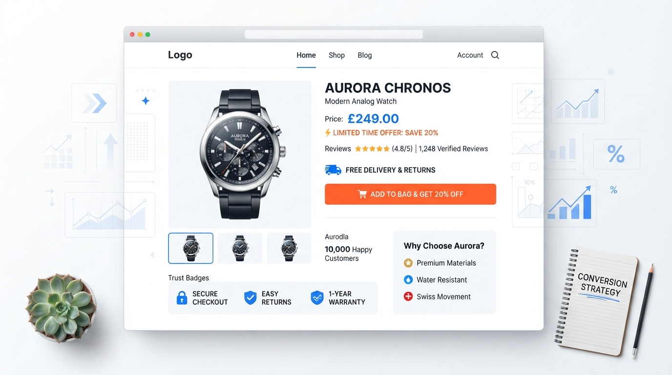
The highest-converting product pages have one primary call-to-action button, placed above the fold, with high contrast against the background. Pages with a single, clear CTA saw 34% higher click-through rates than pages with multiple competing buttons (Add to Cart, Buy Now, Add to Wishlist, Save for Later).
The CTA copy matters too. Action-oriented copy that tells the shopper what happens next outperforms generic copy. 'Add to Cart' is the industry default, but 'Add to Bag' or 'Get Yours Now' can increase clicks by 10-15% depending on the product category. For luxury products, 'Add to Collection' or 'Reserve Now' can reduce price sensitivity and increase perceived value.
How to Optimise Your CTA
- Use a single primary CTA button. Remove secondary buttons or move them below the fold.
- Ensure the CTA button colour contrasts with the background. Orange and blue buttons consistently outperform grey or white buttons.
- Place the CTA above the fold so it is visible without scrolling on both desktop and mobile.
- Use action-oriented copy that tells the shopper what happens next.
- On mobile, make the CTA button full-width and sticky so it remains visible as the shopper scrolls.
34%
higher click-through rate for product pages with a single, high-contrast CTA above the fold
Element 4: Shipping Transparency (28% Less Abandonment)
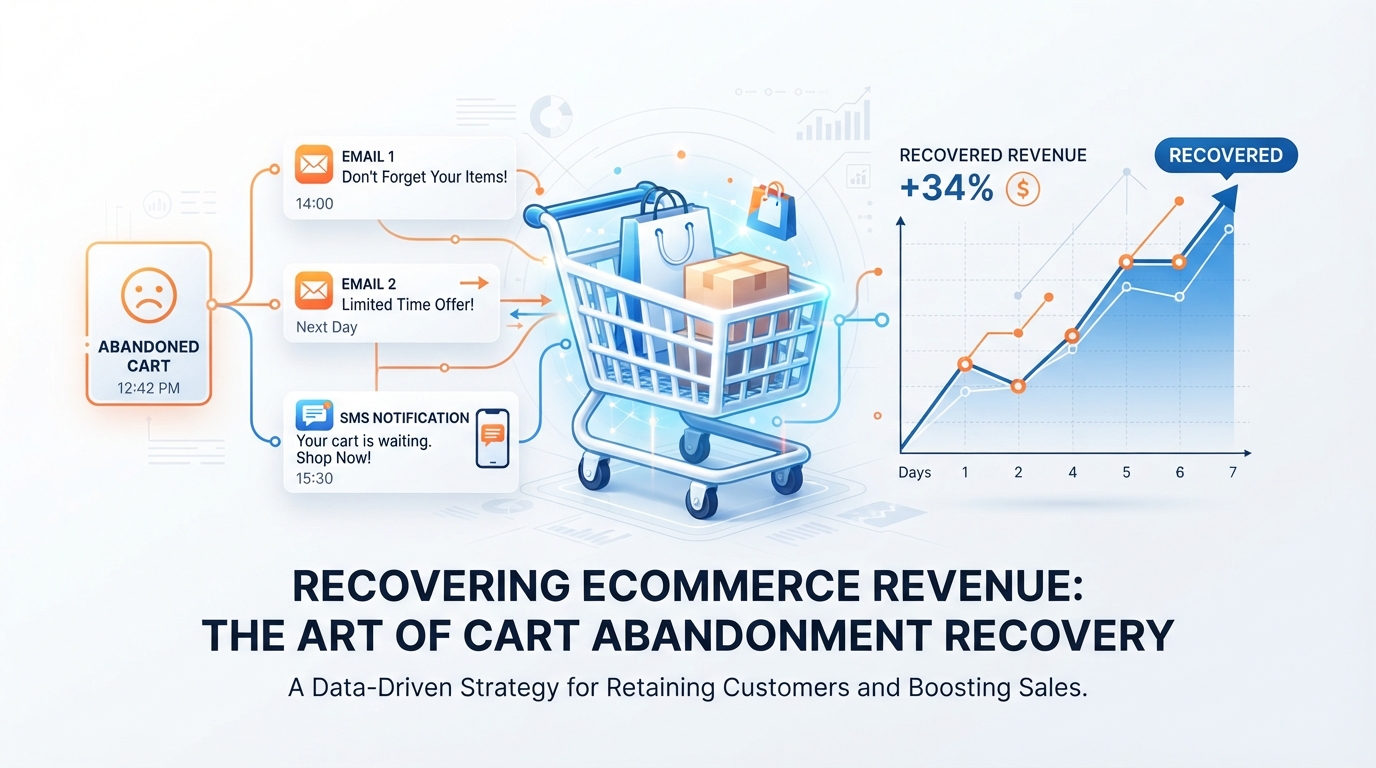
Unexpected shipping costs are the number one reason shoppers abandon carts. According to Baymard Institute, 48% of cart abandonments are caused by extra costs including shipping, tax, and fees. The solution is not to offer free shipping (though that helps). The solution is to show shipping costs on the product page, before the shopper reaches checkout.
In our analysis, product pages that displayed shipping costs (or a free shipping threshold) above the CTA button saw 28% less cart abandonment. When shoppers know the total cost before clicking, they are far less likely to abandon at checkout. If you offer free shipping, say so prominently. If you charge for shipping, show the cost or let shoppers enter their postcode for an estimate.
How to Optimise Shipping Transparency
- Display shipping costs or a free shipping threshold above the CTA button.
- If you offer free shipping over a threshold, show how close the shopper is (e.g. 'Add £12 more for free shipping').
- Show estimated delivery dates on the product page, not just at checkout.
- If you charge for shipping, let shoppers enter their postcode for an accurate estimate before checkout.
- Include trust badges (secure checkout, money-back guarantee) near the CTA to reduce purchase anxiety.
Element 5: Product Description That Sells Benefits, Not Features
The product pages that convert above 3.8% do not list features. They sell outcomes. Instead of '100% cotton, machine washable', they write 'Breathable cotton that keeps you cool in summer and softens with every wash.' Instead of '500 lumens, 12-hour battery', they write 'Bright enough to light your entire campsite for a full night.'
This is not about being clever. It is about answering the shopper's real question: 'What will this do for me?' Feature lists answer 'what is it?' Benefit copy answers 'why should I care?' The high-converting pages we analysed all used a consistent structure: a short benefit-led headline, 2-3 paragraphs of benefit copy, and a scannable bullet list of key features for shoppers who want the details.
How to Write a Converting Product Description
- Lead with a benefit headline (one sentence) that answers 'what will this do for me?'
- Write 2-3 short paragraphs that expand on the key benefits, using sensory and emotional language.
- Include a scannable bullet list of 5-8 key features for detail-oriented shoppers.
- Address common objections in the copy (e.g. 'Will this fit?' 'Is it durable?' 'What if I do not like it?').
- Keep paragraphs to 2-3 sentences. Long blocks of text reduce readability and conversion.
Element 6: Mobile-First Layout (60% of Shoppers)
Over 60% of ecommerce traffic now comes from mobile devices. Yet many product pages are still designed for desktop and then adapted for mobile, resulting in tiny images, cramped text, and CTA buttons that are hard to tap. The high-converting pages we analysed were designed mobile-first, meaning every element was optimised for a 375-pixel screen before being scaled up to desktop.
On mobile, the product page structure should be: sticky image carousel at the top, product title and review stars immediately below, price and shipping info next, a full-width sticky CTA button at the bottom of the screen, and product description and reviews below the fold. This structure keeps the most important information visible and the CTA always accessible.
60%
of ecommerce traffic comes from mobile devices, making mobile-first product page design essential
The Formula, Summarised
If you apply only the six elements above, your product page will outperform the majority of ecommerce stores. Here is the formula in one sentence: 5+ high-quality images, review stars above the fold, a single high-contrast CTA, transparent shipping costs, benefit-led copy, and a mobile-first layout. Most stores get 2 or 3 of these right. The stores converting above 3.8% get all 6 right.
The good news is that none of these changes require a rebuild. They are structural improvements you can test and implement on your existing product pages. Start with images and reviews above the fold, then work your way through the list. Each element compounds on the last, and the cumulative effect is measurable within 30-60 days.